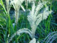
Got my first Kodak film back today (standard, cheap, "Gold something", ISO 100). Wow! Disneyland on steroids.
The susuki picture isn't bad... (I mean, deep saturated colours look good here.)
I'm using an 800x600 version (Gallery) as wallpaper even as we speak. (And, extraordinarily, if you look at the full-size version, this cheap zoom lens is actually producing a facsimile of sharpness for once.)
...but then [LEFT] Gansandaishi (seen advertising for your money on tv quite often) - bleaghf!
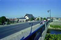
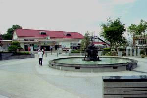
Compare and contrast with (standard, cheap) Fujicolor picture of the station...[RIGHT]
Where did I go wrong? The station pic was back in July, on a hot, hazy day, so probably not the best light to start with. Is it overexposed? Is it the film?
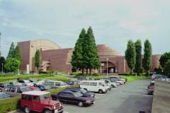
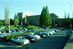
One problem is that I want to put some of these on the same page ("other nice bits of Sano"). Here's two of Bunka Kaikan, the left on Fujicolor in July, the right on Konica in November. Fuji at least gets the brick brick-coloured; Konica (only an experiment) seems to be uniformly a lurid green. (Actually Adriana was on Konica, and I managed to colour-correct: am I thinking wrong? Should I just expect to yank all these things around in PaintShop??